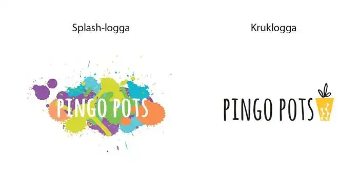
Ямар чиглэлд логотип хийх вэ?
Би хоёр сонголттой тулалдаж байна, тоглоомын сэтгэлгээ, шинэ санаа дамжуулахыг хүсч байна, гэхдээ энэ нь хэт тэнэг болохгүй байх ёстой. Мөн ноцтой байдал, өндөр чанарын мэдрэмжийг дамжуулах ёстой. Splash логотипын фонт нь өөрчлөгдөж болно, мөн бидний керамик логотиптой холбоотой санаа нь жижиг splash эсвэл өөр элемент оруулах явдал юм.
Надад туслаарай, таны бодлыг хуваалцаарай =)

Таны бодлоор Pingo Pots-д аль логотип хамгийн тохиромжтой вэ?
Та хэрхэн бодож байгаагаа бичиж өгнө үү
- the pot logo is nicer, but the other one shows more playfulness, so the idea of adding a little splash to the pot logo sounds excellent!
- clean and modern (i hate the word modern but you get what i mean). kiss, charlotta.
- i think the crow logo will look nicer if made in different sizes.
- clear and easy to read, the simple is easy to remember.
- absolutely this little rascal, very cozy :) go for it! /anton
- the splash logo is nice, but i think it requires a bolder font for the text to be properly visible. therefore, i vote for the pot logo. one tip is to take a look at the logo from different distances, and also try squinting a bit. that way, you'll get a sense of how easy it is to recognize and distinguish from others. if you're interested in the color splashes, they can be improved with a different or bolder font. it might even be enough to fill in the gaps in the p and o. by the way, i would love to see you soon! hugs/ e
- i'm not really that colorful, so there's a chance i would be put off by the flashy :)
- the splash logo is cool, but a bit unclear. it also feels more childish. a bit like a children's clothing brand... if you choose it anyway, i would switch to black text and maybe replace the purple color with a lighter one. the pot logo is clear, more serious but still a bit fun and creative.
- works in all media, all colors - clear, minimalist, elegant. hugs lg ;-)