कुन दिशा मा लोगो?
म दुई विकल्पहरूसँग लड्दैछु, खेलकुद, नवप्रवर्तनलाई व्यक्त गर्न चाहन्छु तर यो बेतुकको नबनोस्। यसले गम्भीरता र उच्च स्तरको अनुभव पनि व्यक्त गर्नुपर्छ। स्प्लाश-लोगोको फन्ट स्वाभाविक रूपमा परिवर्तन गर्न सकिन्छ र क्रुक-लोगोको लागि हाम्रो विचार भनेको यसलाई थोरै जीवन्त बनाउनको लागि सानो स्प्लाश वा अन्य तत्व समावेश गर्नु हो।
कृपया मलाई तपाईंको विचारमा मद्दत गर्नुहोस् =)
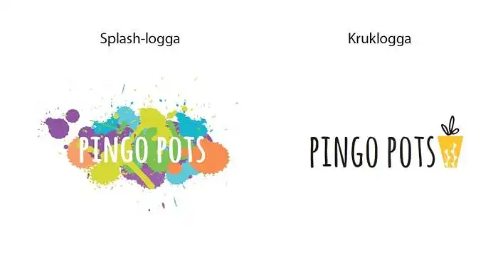
कुन लोगो तपाईंलाई पिंगो पोट्सको लागि सबैभन्दा उपयुक्त लाग्छ?
कृपया तपाईंको विचार लेख्नुहोस्
- the pot logo is nicer, but the other one shows more playfulness, so the idea of adding a little splash to the pot logo sounds excellent!
- clean and modern (i hate the word modern but you get what i mean). kiss, charlotta.
- i think the crow logo will look nicer if made in different sizes.
- clear and easy to read, the simple is easy to remember.
- absolutely this little rascal, very cozy :) go for it! /anton
- the splash logo is nice, but i think it requires a bolder font for the text to be properly visible. therefore, i vote for the pot logo. one tip is to take a look at the logo from different distances, and also try squinting a bit. that way, you'll get a sense of how easy it is to recognize and distinguish from others. if you're interested in the color splashes, they can be improved with a different or bolder font. it might even be enough to fill in the gaps in the p and o. by the way, i would love to see you soon! hugs/ e
- i'm not really that colorful, so there's a chance i would be put off by the flashy :)
- the splash logo is cool, but a bit unclear. it also feels more childish. a bit like a children's clothing brand... if you choose it anyway, i would switch to black text and maybe replace the purple color with a lighter one. the pot logo is clear, more serious but still a bit fun and creative.
- works in all media, all colors - clear, minimalist, elegant. hugs lg ;-)