Камино Клотинг Ко.
Шумо чандсола ҳастед?
- 19
- 28
- 24
- 27
- 27
- 42
- 26
- 42
- 25
- 42
Шумораи касбии шумо чист?
- self-employed
- software engineer
- engineer
- self-employed
- sz
- doctor
- academician
- homemaker
- student
- homemaker
Кадом брендро шумо бештар дӯст медоред?
- aurilia
- vibes
- s
- allen solly
- lee cooper
- lifestyle
- skybags
- lee cooper
- calvin klein
- a&f
Стил ва либоси шумо чӣ гуна аст?
Лутфан фалсафаи брендро хонед ва фикратонро дар шакли рейтинги 1-10 пешниҳод кунед, 1 нишондиҳандаи комилан нобуд шудани логика ва 10 нишондиҳандаи идеологияи аъло
Логотип A1: Инро дар миқёси 1-10 рейтинг кунед

Фикрҳо, агар бошад?
- i would rate it 7 because the logo looks busy.
Логотип A1 Ариза: Инро дар миқёси 1-10 рейтинг кунед
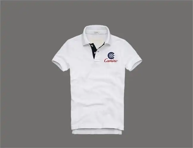
Фикрҳо, агар бошад?
- i would rate it a 7. i like the product, a casual polo that aligns with the casual philosophy of camino, but if i wanted to showcase a product, i would choose something edgier.
Логотип A2: Инро дар миқёси 1-10 рейтинг кунед

Фикрҳо, агар бошад?
- i would rate it 6 because the logo looks busy and i prefer the script over bold letters.
- the star in the center shining is a symbol of growth and strength to deliver.
Логотип A2 Ариза: Инро дар миқёси 1-10 рейтинг кунед

Логотип B1: Инро дар миқёси 1-10 рейтинг кунед
Фикрҳо, агар бошад?
- the blue one is nice. the red is a sign of anger.
- i like the italic typography of the brand name; it makes it look more classy and sophisticated. however, i think the color palette can be explored more, but it does look very marine and navy-like and has an explorer feel to it!
Логотип B1 Ариза: Инро дар миқёси 1-10 рейтинг кунед

Фикрҳо, агар бошад?
- almost all the shirts i rated lower because somehow the overall feel and appeal are lost when the logo is applied to the shirt. it may be due to the typicality of the color, making it look like something a doctor or nurse would wear, just saying! as mentioned earlier, exploring a bit of color options may help; otherwise, when seen separately, the logo is appealing!
Логотип B2: Инро дар миқёси 1-10 рейтинг кунед
Логотип B2 Ариза: Инро дар миқёси 1-10 рейтинг кунед
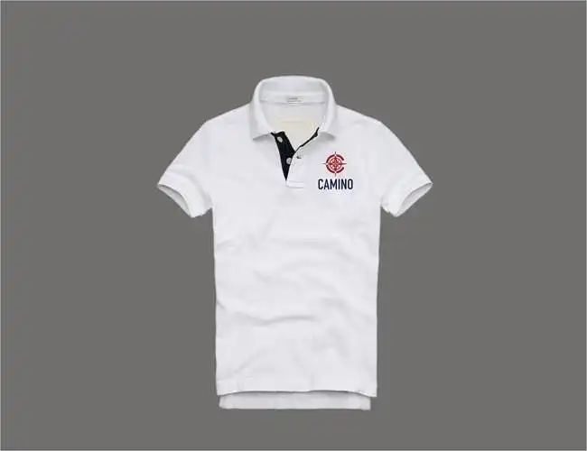
Логотип C1: Инро дар миқёси 1-10 рейтинг кунед

Фикрҳо, агар бошад?
- i would rate it 6 because the compass is clearer in the first two designs, a little less clear in this one.
- it's a nice style.
Логотип C1 Ариза: Инро дар миқёси 1-10 рейтинг кунед

Логотип C2: Инро дар миқёси 1-10 рейтинг кунед

Логотип C2 Ариза: Инро дар миқёси 1-10 рейтинг кунед
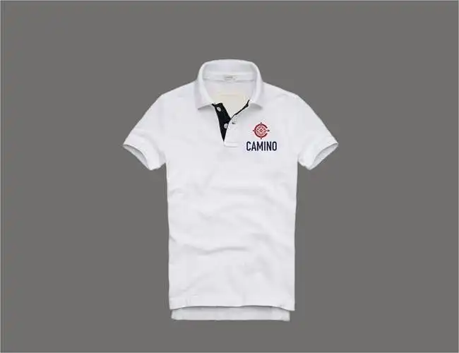
Лутфан ин логотипҳоро рейтинг кунед

Лутфан фикрҳои худро дар бораи хусусиятҳои логотипе, ки шумо бештар дӯст медоред, мубодила кунед.
- i like italic style writing.
- s
- the logo should be eye-catching to the person who looks at it.
- none
- it's visually appealing
- bold
- regarding the logo placement on the shirt, i will find it more attractive if the logo is a little smaller than it is now, maybe something like 10:8 of the current size.
- it's clean and sharp. the color scheme should be reversed, with the symbol in navy and the text in red. the color tones are correct. the application of the logo should be considered, as it may not be very prominent on a dark background. the placement of the logo should not be in front, as the brand is new to consumers; it should only be applied to the visible part once it is accepted in the market.
- i like the fact that there is a compass that suggests a sense of adventure, which aligns with camino philosophy. i would suggest a few changes. right now, the logo (let's say b1) looks somewhat busy. so if there was a way to reduce the size of the compass and position it around c in such a way that people would immediately recognize it as a compass, yet the overall logo should appear less busy and more clean. one way you might achieve this is by not showing the complete compass but just a part of it. in a few words, camino's logo should be edgy, clean, and evoke thoughts of adventure.
- it shows the spark.
Лутфан фикрҳои худро дар бораи хусусиятҳои логотипе, ки шумо камтарин дӯст медоред, мубодила кунед.
- all letters in block
- a
- it is dull.
- none
- it's disgusting.
- uneven
- the font is not really great.
- it's too thick and the text font is not appealing to me.
- i liked c2 the least because, although there is a compass, it is less edgy than b1, and some people may not even recognize it as a compass but rather as a map logo indicating east, west, north, and south.
- it's saying too much with confusion.