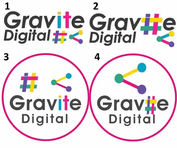
Ո՞ր լոգոն է լավագույնը թվում:
Մենք ունենք մեր նոր Gravite Digital ընկերության լոգոյի 4 տարբերակ: Մենք պարզապես ուզում ենք իմանալ, թե որն է մարդկանց ամենաշատը դուր գալիս:
Ո՞ր լոգոն է ձեզ ամենաշատը դուր գալիս:
(Ընտրովի) Ո՞ր տեսակի բիզնես ենք մենք / Ի՞նչ ենք անում:
- computer teaching
- photography may be
- digital art?
- data protection
- mindset
- graphic designers for software?
- fjbjj
- digital art
- digital
- digital design
(Ընտրովի) Մեկնաբանություններ անվան կամ լոգոյի մասին / Լոգոյի բարելավման առաջարկներ:
- up to their talent
- insert some digital prints
- remove the hashtag thing?
- there's a bit too much going on; i would decide to put in the # or the bubble thing.
- so much pink
- 4
- from a web design perspective, the first logo is simple yet complex at the same time. it's the most eye-catching. the slight highlighting of "it" conveys the idea of an information technology perspective, which is beneficial for a digital company.
- i think it overwhelms your mind with too many colors at first glance. maybe fewer colors would have more effect. perhaps you shouldn't use base cykm colors; it might deter geeks with an unprofessional attitude.
- gfjhj
- the two symbols are too much together. i like the colored letters, but i would lose one of the symbols.