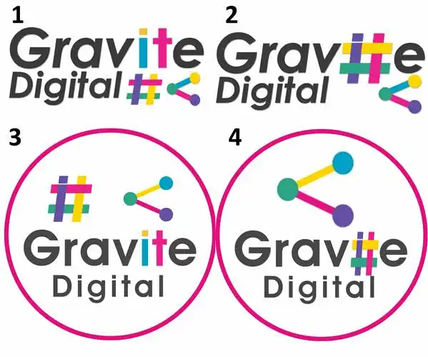
Kî logo ya herî baş e?
Em 4 versiyonên logo ya nû ya şîrketê me ya Gravite Digital hene. Em tenê dixwazin bizanin kî janî kesan herî baş e.
Kî logo ya te herî baş e?

(Bi xwêzî) Çi curekî şîrket in / Em çi dikin?
- computer teaching
- photography may be
- digital art?
- data protection
- mindset
- graphic designers for software?
- fjbjj
- digital art
- digital
- digital design
(Bi xwêzî) Şîroveyên li ser Nav an Logo / Pêşniyarên bo Pêşkeftina Logo
- up to their talent
- insert some digital prints
- remove the hashtag thing?
- there's a bit too much going on; i would decide to put in the # or the bubble thing.
- so much pink
- 4
- from a web design perspective, the first logo is simple yet complex at the same time. it's the most eye-catching. the slight highlighting of "it" conveys the idea of an information technology perspective, which is beneficial for a digital company.
- i think it overwhelms your mind with too many colors at first glance. maybe fewer colors would have more effect. perhaps you shouldn't use base cykm colors; it might deter geeks with an unprofessional attitude.
- gfjhj
- the two symbols are too much together. i like the colored letters, but i would lose one of the symbols.