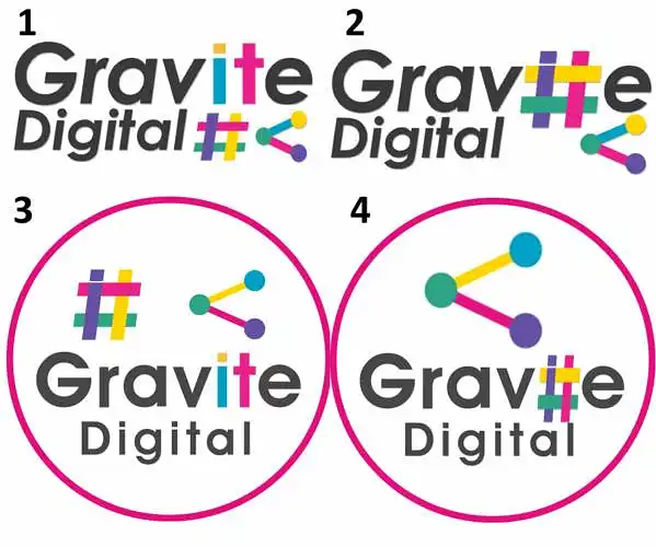
ဘယ်လိုဂျိုကိုကောင်းဆုံးလဲ?
Gravite Digital အတွက် ကျွန်ုပ်တို့တွင် ကုမ္ပဏီဂျိုကို ၄ မျိုးရှိသည်။ လူတွေက ဘယ်ဟာကို အကြိုက်ဆုံးကြောင်း သိချင်ပါတယ်။
ဘယ်လိုဂျိုကို သင်အကြိုက်ဆုံးလဲ?
(ရွေးချယ်စရာ) ကျွန်ုပ်တို့သည် ဘယ်လိုလုပ်ငန်းဖြစ်သနည်း / ကျွန်ုပ်တို့သည် ဘာလုပ်ပါသလဲ?
- computer teaching
- photography may be
- digital art?
- data protection
- mindset
- graphic designers for software?
- fjbjj
- digital art
- digital
- digital design
(ရွေးချယ်စရာ) အမည် သို့မဟုတ် ဂျိုကိုအပေါ် မှတ်ချက်များ / ဂျိုကို တိုးတက်မှုအတွက် အကြံပြုချက်များ
- up to their talent
- insert some digital prints
- remove the hashtag thing?
- there's a bit too much going on; i would decide to put in the # or the bubble thing.
- so much pink
- 4
- from a web design perspective, the first logo is simple yet complex at the same time. it's the most eye-catching. the slight highlighting of "it" conveys the idea of an information technology perspective, which is beneficial for a digital company.
- i think it overwhelms your mind with too many colors at first glance. maybe fewer colors would have more effect. perhaps you shouldn't use base cykm colors; it might deter geeks with an unprofessional attitude.
- gfjhj
- the two symbols are too much together. i like the colored letters, but i would lose one of the symbols.