ලොගෝවට කුමන දිශාවක්ද?
මට දෙකක් අතර සටන් කරමින් සිටිමි, විනෝදය, නව නිර්මාණය ප්රකාශ කිරීමට කැමතියි නමුත් එය අසාර්ථක නොවී. එය ගැඹුරු බව සහ ඉහළ මට්ටමේ හැඟීමක් ද ප්රකාශ කළ යුතුය. ස්ප්ලෑෂ්-ලොගෝවෙහි අකුරු රීතිය ස්වභාවිකව වෙනස් කළ හැකිය සහ අපට තිබූ කුඩු-ලොගෝවට අදහසක් වන්නේ එය ටිකක් ජීවිතය ලබා දීමට කුඩා ස්ප්ලෑෂ් හෝ වෙනත් අංගයක් ඇතුළත් කිරීමයි.
කරුණාකර ඔබේ අදහසෙන් මට උදව් කරන්න =)
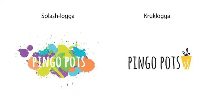
කුමන ලොගෝවක් Pingo Pots සඳහා හොඳම බව ඔබ සිතනවාද?
ඔබ සිතන ආකාරය ලියන්න
- the pot logo is nicer, but the other one shows more playfulness, so the idea of adding a little splash to the pot logo sounds excellent!
- clean and modern (i hate the word modern but you get what i mean). kiss, charlotta.
- i think the crow logo will look nicer if made in different sizes.
- clear and easy to read, the simple is easy to remember.
- absolutely this little rascal, very cozy :) go for it! /anton
- the splash logo is nice, but i think it requires a bolder font for the text to be properly visible. therefore, i vote for the pot logo. one tip is to take a look at the logo from different distances, and also try squinting a bit. that way, you'll get a sense of how easy it is to recognize and distinguish from others. if you're interested in the color splashes, they can be improved with a different or bolder font. it might even be enough to fill in the gaps in the p and o. by the way, i would love to see you soon! hugs/ e
- i'm not really that colorful, so there's a chance i would be put off by the flashy :)
- the splash logo is cool, but a bit unclear. it also feels more childish. a bit like a children's clothing brand... if you choose it anyway, i would switch to black text and maybe replace the purple color with a lighter one. the pot logo is clear, more serious but still a bit fun and creative.
- works in all media, all colors - clear, minimalist, elegant. hugs lg ;-)