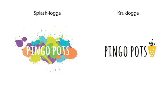
What direction for the logo?
I'm struggling with two options, I want to convey playfulness, innovation but without it becoming silly. It must also convey seriousness and a top-notch feel. The font on the splash logo can be changed of course and one idea we had with the pot logo is to include a small splash or other element to liven it up a bit.
Please help me with your opinion =)